Holmz Design System

Shipped
Holmz Admin
Crafting a new Admin Experience for Holmz
As the Product Design Lead at JumpStartCSR, I led the creation of our first design system, developing foundation styles and UI components. The new design system ensured consistency across features and streamlined engineering codebases.
outcome
Highlights
A platform agnostic design system designed for consistency and ease of use
Holmz is an AI-powered health platform built for proactive and predictive care. It uses wearable data and motion tracking to help organizations detect and prevent injuries, monitor recovery, and improve adherence to wellness programs. It’s used by physical therapists, clinicians, and users in enterprise wellness programs.
Instead of adding more complexity onto Holmz, we built and shipped a new platform to support this need, overhauling the brand identity and building out a new design system from scratch to set a foundation for future scale the ecosystem as Holmz continues to grow.
Holmz is an AI-powered health platform that helps organizations monitor biomechanics, injury risk, and recovery adherence using motion tracking and wearable data. It’s used by group managers, clinicians, and wellness coaches to make preventative care more actionable.
In early 2025, an internal audit tied to an upcoming grant opportunity revealed a few things:
Holmz’s platform had grown in complexity, with overlapping features and unclear workflows.
The visual brand felt outdated—misaligned with the trust and innovation expected in AI-driven health tech.
Most importantly, Holmz lacked the infrastructure to track product usage and outcomes—critical for both reporting and scaling.
We saw this not as a failure point, but as an opportunity. One that called for a redesign—not just of the interface, but of the platform’s foundation.


Context
The existing component library outgrew its use and couldn’t support new product launches and features
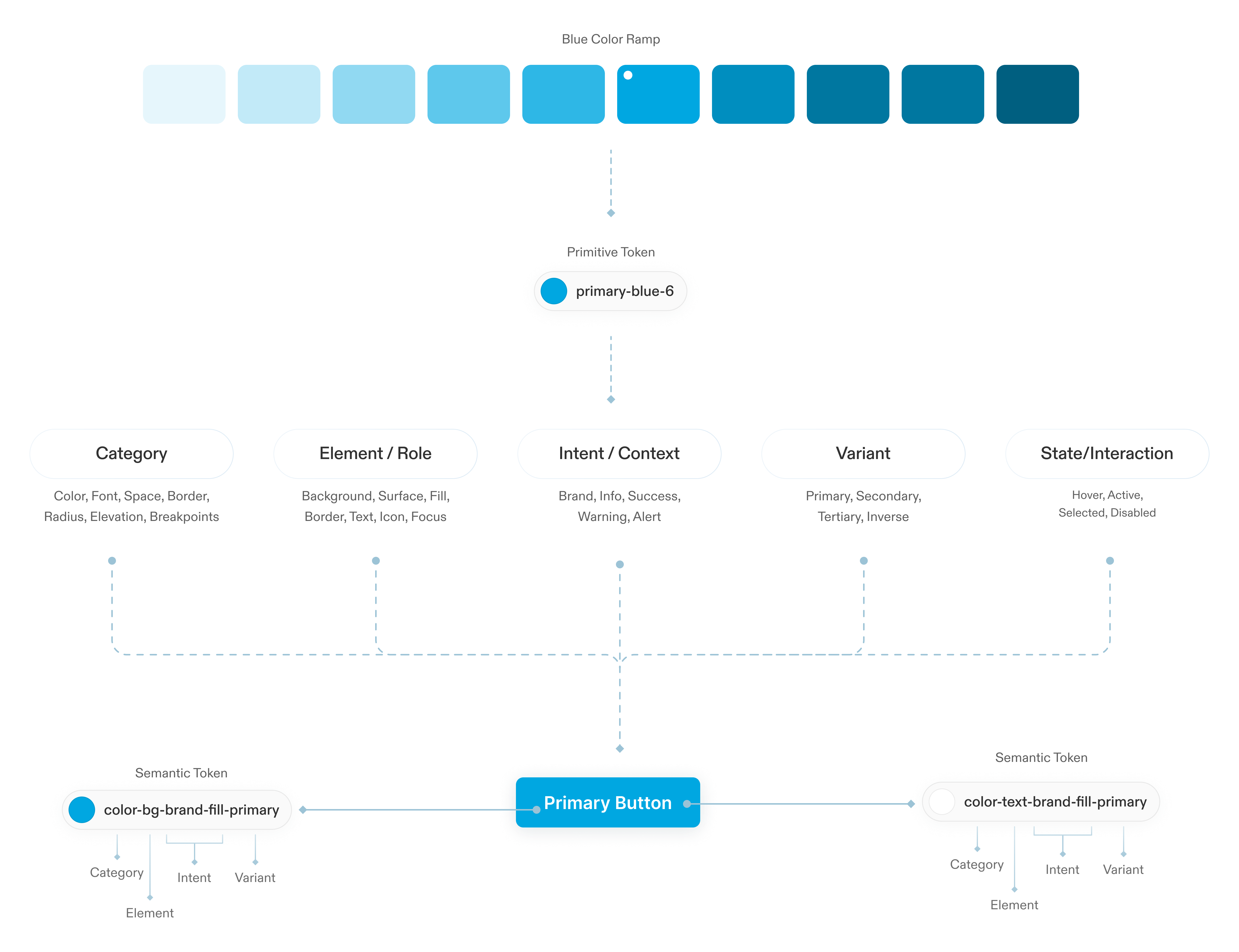
Tokens:I set up tokens so that we could ensure scalability and consistency.Components:We had no component libraries. I focussed on creating one so we could have quicker product design. There is a need to create an interactive component library to increase collaboration between developers and designers working on the Sereberus suite of projects within PNNL. Across all of PNNL's Serberus projects, the Blueprint Design System by Palantir is the backbone of all visual systems. However, designers used Figma and Adobe XD, while developers lacked access to these tools, causing fragmented workflows, lowering design consistency, and hindering inter-team communication.The goal was to create a central Figma component library that was built using HTML language to improve standardization.As a early-stage start-up, their primary focus is on quick ideation and testing. The team needed a design system that is easy to use, aligned with code, and flexible enough to handle creating new features quickly. Since JSCSR also works with external developers and contractors, the handoff from design teams to development teams was also. The library should enable a seamless creation of mockups and wireframes that can be translated into functional tools.I developed a comprehensive design system that improved design consistency and cross platform efficiency across multiple projects with 200+ users.

process
Auditing what we already have
I looked into what we components we were using across our iOS app and website to a establish a design system that could support a web app, website and an iOS app. Building an admin web-app also gave us an opportunity to reestablish JSCSR as a modern brand and overhaul the current UI. This meant auditing all existing components that were being used across the iPad app and website, and design fresh new components to support the brand across different platforms.

process
Establishing a shared language through tokens
Maintaining the terminology used by developers within the component library, there was now a standardized language used between designers and developers.
process
Using atomic design principles for modularity/component architecture/to create component structures.
Before starting the project, I knew I needed to learn more about the basics and best practices of design systems.I focused on reading about Brad Frost's atomic design principles. Based on this, I knew that a modular design system that built upon itself would be beneficial. I learned how to distinguish complex UI elements as abstract or concrete, or as structure or content. I’ve experimented with several ways to construct components in Figma that balance the needs of aligning with code, easy for consumers to use and system designers to maintain.Using an atomic design approach for building components allows for handling sizes at the atomic level instead of having every size for every component. This means creating various sizes for atomic components that get used repeatedly and nesting them inside more complex components. This keeps file sizes and component matrixes down. Following the atomic design principle, all complex UI elements are composed of nested components. This modularity facilitates file-wide design changes and enables complex components to be edited through the property panel. This principle continues to the sticker sheet, which provides descriptions and links to additional documentation for each component. The categorized structure allows for quick scanning and further context for potential use cases.

process
Documentation and guidelines
Before starting the project, I knew I needed to learn more about the basics and best practices of design systems.I focused on reading about Brad Frost's atomic design principles. Based on this, I knew that a modular design system that built upon itself would be beneficial. I learned how to distinguish complex UI elements as abstract or concrete, or as structure or content. I’ve experimented with several ways to construct components in Figma that balance the needs of aligning with code, easy for consumers to use and system designers to maintain.Using an atomic design approach for building components allows for handling sizes at the atomic level instead of having every size for every component. This means creating various sizes for atomic components that get used repeatedly and nesting them inside more complex components. This keeps file sizes and component matrixes down. Following the atomic design principle, all complex UI elements are composed of nested components. This modularity facilitates file-wide design changes and enables complex components to be edited through the property panel. This principle continues to the sticker sheet, which provides descriptions and links to additional documentation for each component. The categorized structure allows for quick scanning and further context for potential use cases.

